Google Unveils New Android Logo with Brighter Colors and More Playful Design
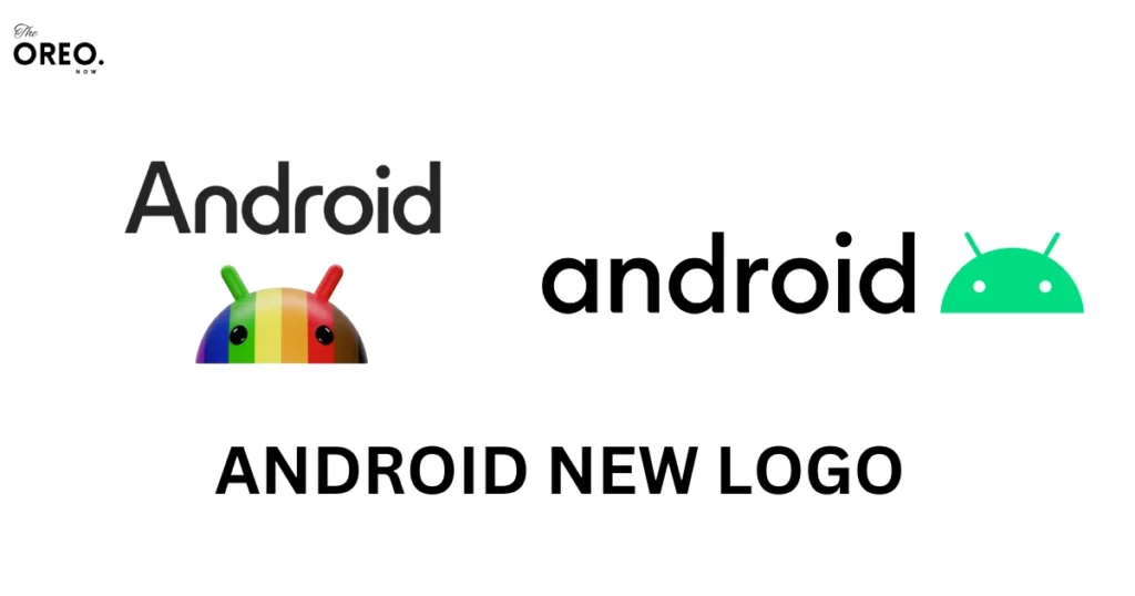
On September 6, 2023, Google announced a slight upgrade to Android Logo. The new Android logo is a bit more colorful and more playful with brighter colors as compared to the previous Google logo.
Google’s new Android logo is more prominent and simplified with a vibrant logo. Google has also significantly upgraded its At a Glance Google Assistant widget.
The new Google widget is a more visually charming and informative interface to see the information you need at a glance.
Some of the key changes in the new Android logo:
The new Android logo introduces a refreshing visual transformation. With its sleek and modern design, it reflects Google’s commitment to innovation and evolution.
This update showcases a departure from tradition while maintaining the essence of Android’s identity, hinting at exciting changes in the world of mobile technology.
Here are some of the key changes in the new Android logo.
- The colors are brighter and more vibrant. The previous Android logo used a more muted color palette, with a light green and blue.
The new logo uses brighter colors, with a lime green and cyan. This makes the logo more eye-catching and engaging.
- The shape is more simplified, with the curves made more pronounced. The previous Android logo was a more complex shape, with sharp angles and straight lines.
The new logo is more simplified, with curves that are more pronounced. This makes the logo look more playful and less formal.
- The text is more playful and less formal. The previous Android logo used a more formal font, with straight lines and sharp corners.
The new logo uses a more playful font, with curves and rounded corners. This makes the logo look more approachable and inviting.
- The overall look is more modern and fresh. The new Android logo is a more modern and fresh take on the previous logo.
It is brighter, more vibrant, and more playful. This makes it a better reflection of the “vibrant and open” nature of Android.
New features of the At the Glance Widget:

Google’s updated “At a Glance” widget features a user-friendly design with a focus on weather information. It offers customizable transparency options for background visibility.
AI-driven improvements provide updates on events, reminders, flights, and weather forecasts in a single view, enhancing accessibility and aesthetics.
- The new look is neater and more up-to-date, with a focus on showing weather details.
s
- You can adjust how much of the background you want to see through, making it your choice
- It uses smart technology to give you updates on things like upcoming events, reminders, flight info, and weather predictions.
- You can check your calendar and reminders all in one place.
- You can quickly see what the current weather is like and what’s expected in the future.
- The time and date are displayed in a bigger font to make them easier to read.
Conclusion:
The updated Android logo is a discreet yet impactful alteration poised to greatly influence the Android brand’s appearance.
Enhanced with brighter hues, simplified forms, and a playful font, the logo becomes more visually striking, captivating, and approachable.
This modern and fresh aesthetic better aligns with Android’s “vibrant and open” essence. The revised logo is a well-received and appreciated change among Android users.
Must Read: Stay Organized and Connected with Google’s New Android Productivity Features


