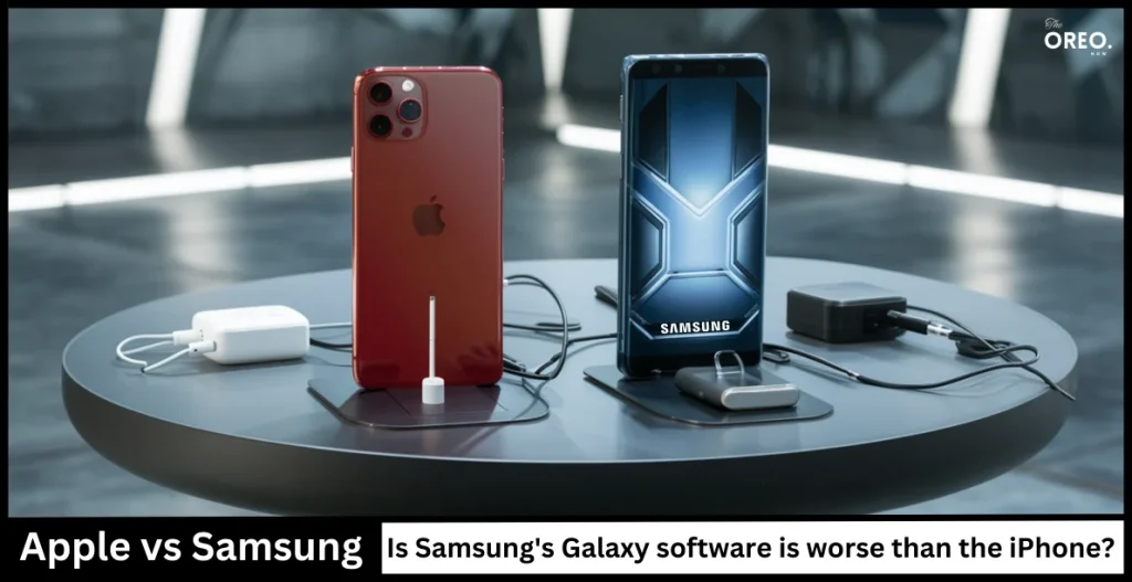
Apple vs Samsung: Is Samsung’s Galaxy software worse than the iPhone?

Smartphone settings can be confusing, but they’re important for managing your phone. Today, we’re comparing how Samsung’s OneUI software and Apple’s iOS handle settings. Spoiler: Apple comes out on top.
The Trouble with Settings
Organizing settings is tough, even for top phones. That’s why looking at how Samsung and Apple handle settings can reveal a lot.
The Perfect Phone: No Settings
In a perfect world, phones wouldn’t need settings. With AI, you could just tell your phone what you need, and it would do it. Samsung’s Bixby tries to do this by managing settings for you.
Samsung’s Complicated Settings
Samsung’s settings can be complex. For example, on a Samsung Galaxy S24, you need to swipe down twice to find all the quick settings buttons. This extra step makes Samsung phones a bit harder to use than Apple’s.
Apple’s Easy Experience
On an iPhone, a single swipe down gives you quick access to settings like brightness, Wi-Fi, and Do Not Disturb. Everything is in one place, making it easy to find what you need quickly.
The Challenge of Hidden Settings
Samsung’s settings can also be hidden. Some useful features, like showing all quick settings with a single swipe, are hard to find. Apple keeps things simple by keeping everything in one place.
The Results
We tested both phones to see how many steps it takes to do common tasks. Apple’s iPhone was faster or tied with Samsung’s Galaxy every time. This means Apple’s phone is easier to use when it comes to settings.
Apple’s iOS is the winner when it comes to smartphone settings. Its simple approach makes managing settings a breeze. Samsung’s OneUI, while full of features, can be more confusing to use. As phones get more advanced, having easy-to-use settings becomes even more important. Samsung will need to make some changes if it wants to keep up with Apple in this area.


